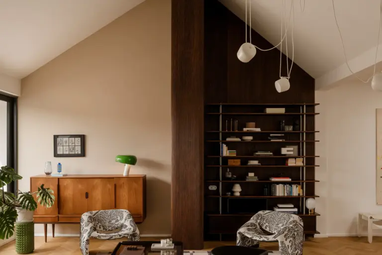
A Madrid apartment by Febrero Studio transforms minimalist interior design with light, shadow, and refined simplicity, creating an elegant, welcoming sanctuary.
In the vibrant heart of Madrid, a stunning project by Febrero Studio highlights the transformative power of minimalist interior design. This apartment, once dark and divided, has been reimagined with a focus on light, shadow, and a sophisticated simplicity.
Architects Mercedes González Ballesteros and Jesús Díaz Osuna have created a space where restraint and thoughtfulness in every detail form a cohesive, welcoming home. Their philosophy of minimalist interior design balances functionality with beauty, resulting in a sanctuary that is healthier, more breathable, and deeply comforting.

A Design Philosophy Rooted in Restraint and Harmony
Febrero Studio’s philosophy for H59 embodies the essence of minimalist interior design. Inspired by the sentiment, “Where light doesn’t reach, perhaps the shadow will shine,” the team at Febrero Studio embraces the beauty of both light and shadow. Rather than filling the space with excess, they achieve a delicate balance, allowing each area to feel harmonious and uncluttered. This minimalist design philosophy not only brings out the beauty in the space but also creates a healthier, more serene atmosphere.
In this approach to minimalist interior design, every room in H59 has a distinct function and ambiance. The spaces remain interrelated yet allow for privacy and flow, creating a home that feels simultaneously open and intimate. This approach reinforces how minimalist interior design can bring calm and connection to each room without overwhelming it.
The Power of an Achromatic Palette and Natural Materials
Colors and materials play a crucial role in Febrero Studio’s minimalist interior design for H59. By using an achromatic palette, they allow the light to sculpt each room’s personality, while creating a seamless connection between spaces.
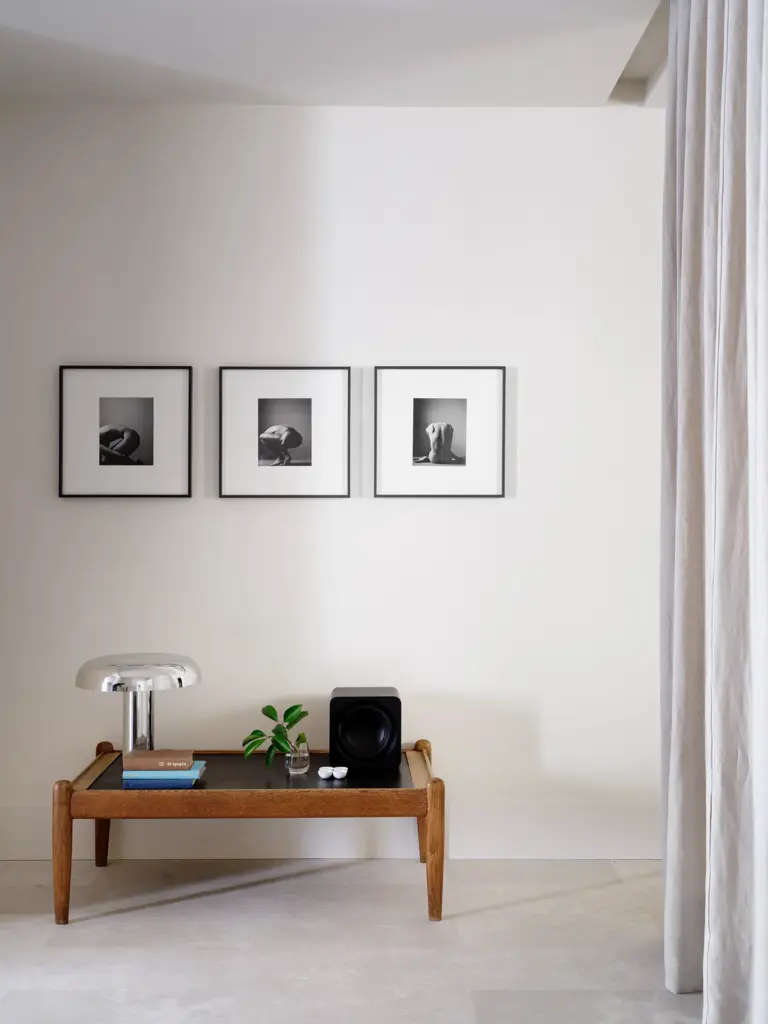
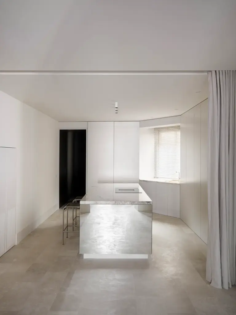
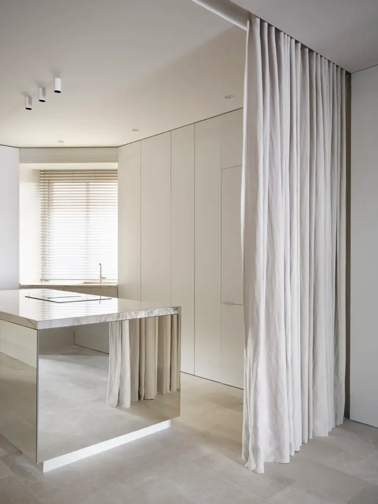
- Kitchen and Entryway: The kitchen and entryway set the tone for the apartment with a palette of soft whites and cream hues. This design choice emphasizes minimalist interior design, using light tones to maximize natural light and keep the space airy. White cabinetry, a mirrored island, and locally sourced creamy limestone work together to capture the light, pushing it deeper into the home and creating a luminous, inviting entrance.
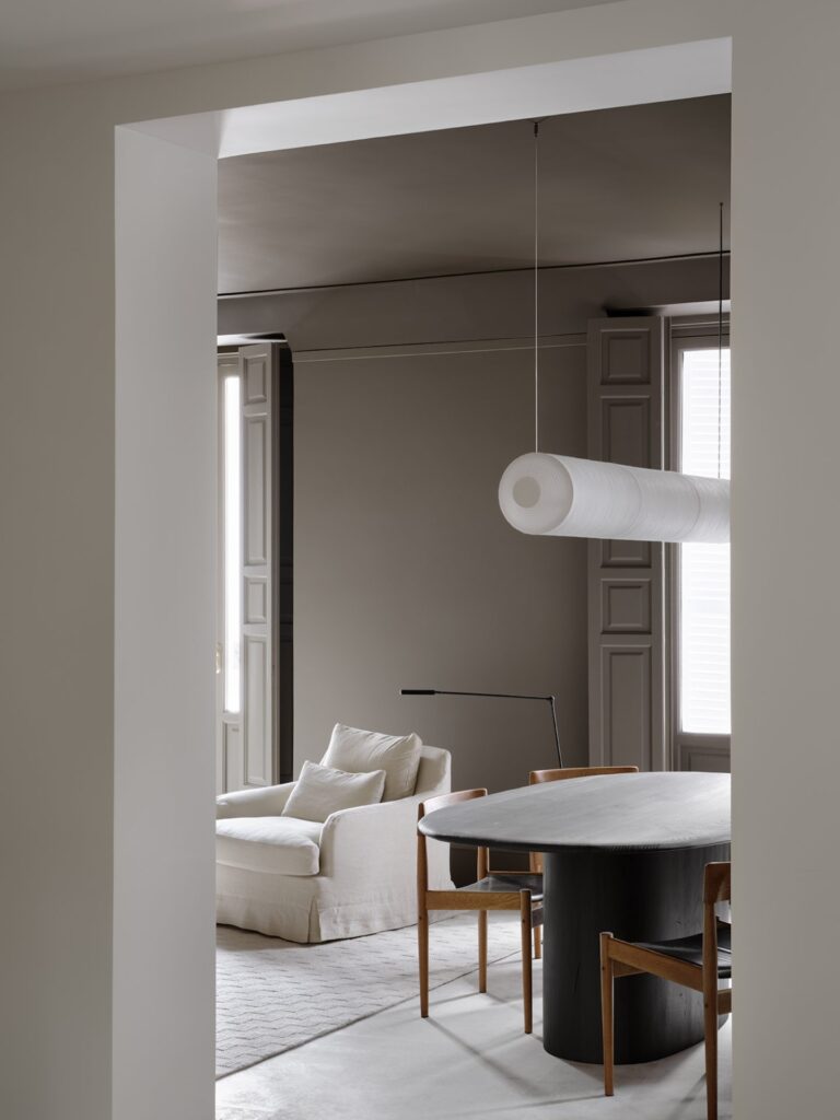
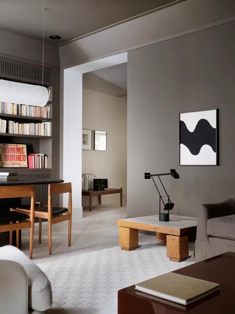
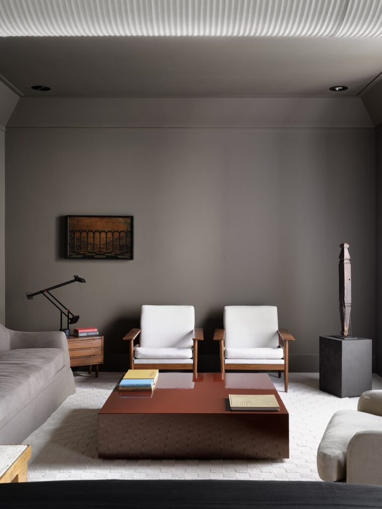
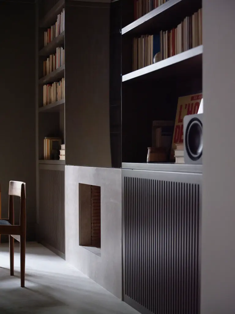
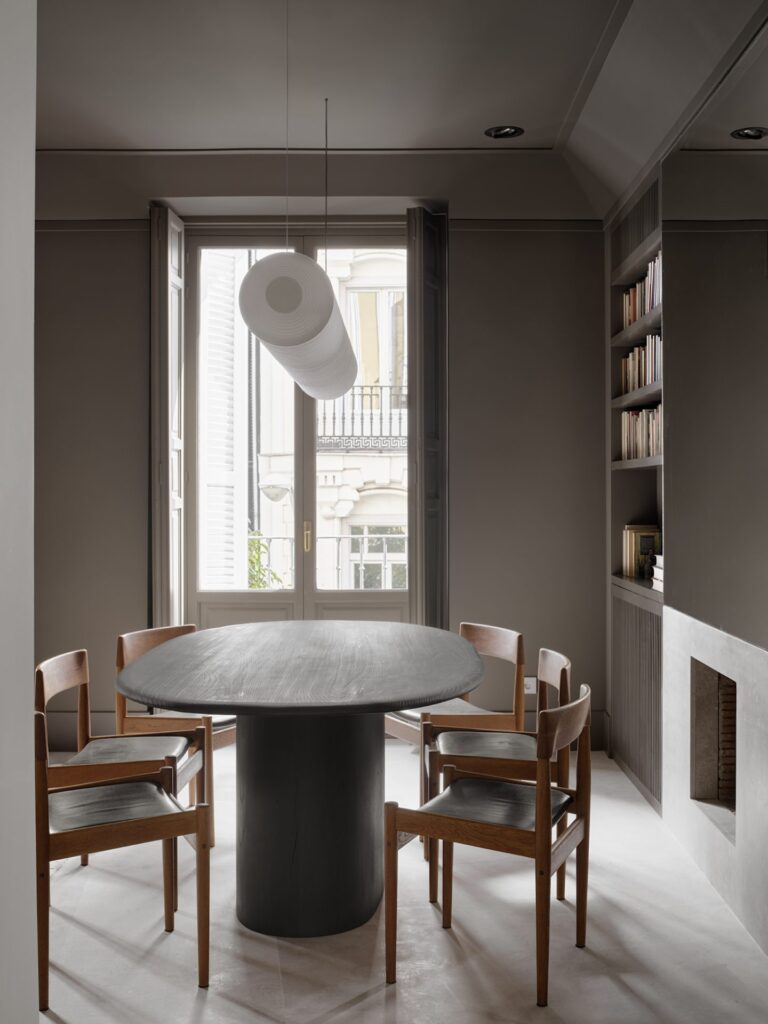
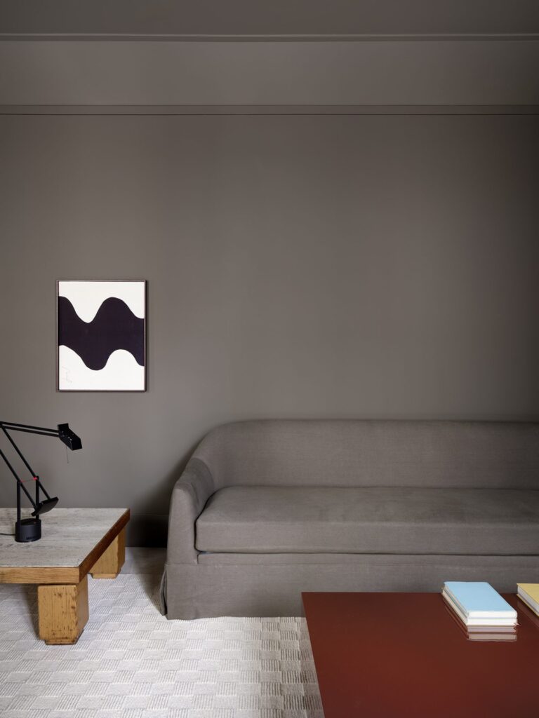
- Living and Dining Areas: Moving to the living and dining areas, the palette shifts to taupe-grey. This subtle variation in tone speaks to the minimalist interior design philosophy by adding depth without distracting from the space’s simplicity. The muted color palette enhances the natural light, allowing these communal spaces to feel both spacious and intimate.
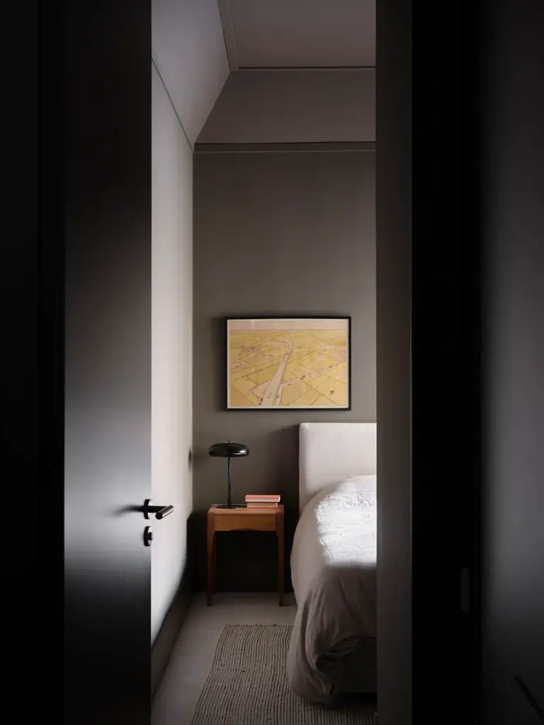
- Bedrooms and Bathrooms: The minimalist interior design approach continues with deeper tones in the bedrooms and ensuite bathroom, where darker hues provide privacy and comfort. Black tiles line the bathroom, creating an intimate and restful retreat. Febrero Studio’s use of darker shades aligns perfectly with minimalist interior design, proving that embracing shadows can add to a space’s warmth and charm.
This thoughtful use of color within minimalist interior design makes H59 an inspiring example of how a restrained palette can create a sense of harmony and unity throughout the space.

Redefining Space: Function Meets Flow
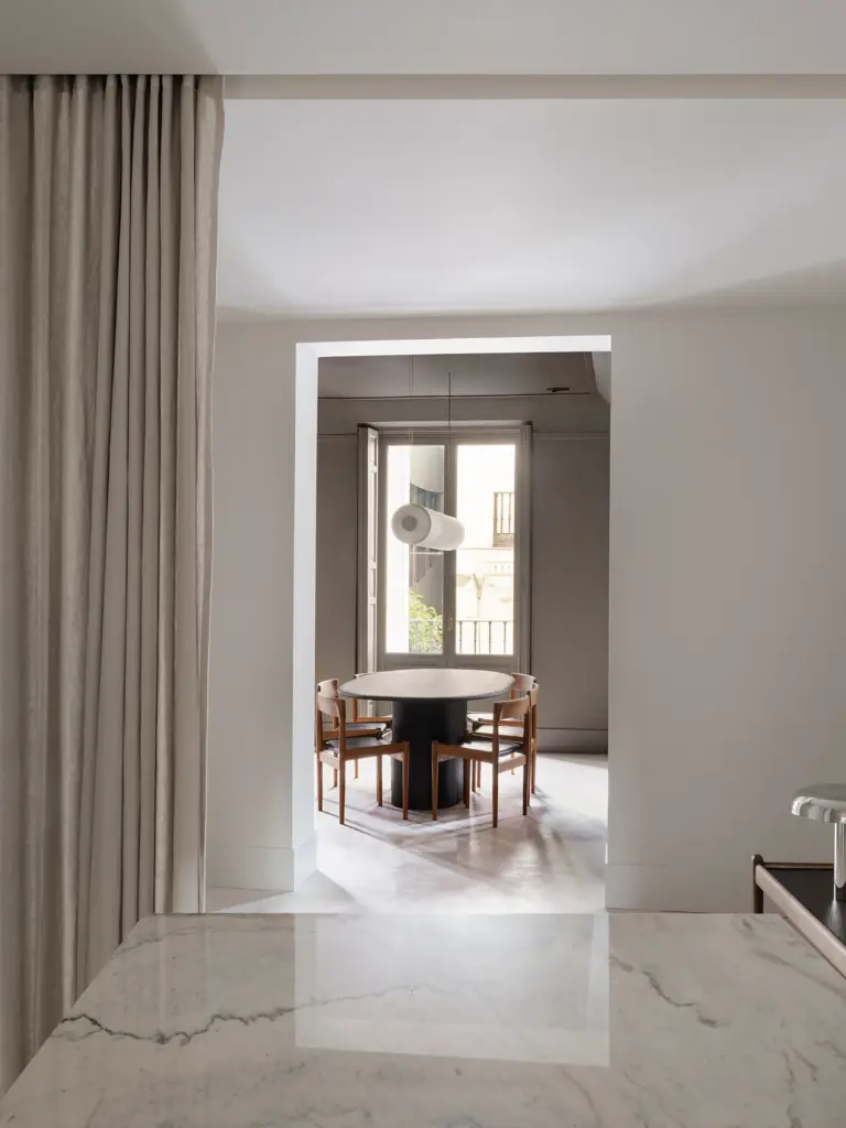
One of the most impressive aspects of H59 is how Febrero Studio redefines the spatial layout to maximize both utility and beauty. Originally, the apartment was overly compartmentalized, with the kitchen, entry, and other spaces broken up by partitions. By combining the kitchen and entry into a central focal point, Febrero Studio creates an open flow that divides social areas from private ones while optimizing light and cross-ventilation. This central space, free of visual clutter, allows natural light to filter from both sides of the apartment.
- Flexible Design Elements: A linen curtain serves as a soft partition between the entry and kitchen. This understated element adds a touch of fluidity, offering the option to close off the kitchen when guests arrive or leave it open to enhance the flow. It’s a delicate, minimalist solution that respects the needs of everyday life while maintaining the design’s visual purity.
- Elevated Ceilings: Another impactful change was the removal of false ceilings, which opened up the space and increased ceiling heights, particularly in the living room and bedrooms. This vertical expansion adds to the apartment’s airy feel, and a massive molding detail was added to complement the now-extended ceilings, enhancing the sense of spaciousness and sophistication.

Personal Touches That Bring Character and Warmth
Minimalist interior design often involves balancing clean lines with elements that add warmth and personality. Febrero Studio accomplishes this by thoughtfully blending custom-designed furniture with carefully chosen high-street finds and rare vintage pieces. Each piece tells a story, imbuing the minimalist backdrop with individuality.
- Kitchen and Living Room Furniture: In the kitchen, the mirrored island stands as a sleek, modern centerpiece, while the dining room hosts a custom wood table, designed to add a tactile contrast to the neutral tones around it. Vintage chairs and an understated light fixture complete the dining setup, while a pair of vintage artworks in the background add subtle character.
- Living Room Details: In the living room, a vintage side table pairs with a minimalist lamp, while a plush sofa is complemented by a custom coffee table designed specifically for this space. Artwork provided by the client adorns the walls, creating a personal touch. Together, these elements create a space that feels as personal as it does cohesive, with each piece reinforcing the home’s understated elegance.
- Bedrooms and Bathroom Accents: In the bedroom, a custom-designed bedhead adds a tailored feel, while in the ensuite, dark tiles and a simple, elegant wall lamp create a sense of luxury. These personal touches bring the space to life, balancing the minimalism of the design with warmth and personality.
The Essence of Minimalist Interior Design
H59 by Febrero Studio is a striking example of how minimalist interior design can transform a space by embracing simplicity, light, and subtlety. Through a carefully chosen palette, refined materials, and a thoughtful layout, Febrero Studio has created a space that feels expansive yet intimate, sophisticated yet personal. The project reminds us that minimalist design is not about stripping away character but rather about revealing it—through restraint, attention to detail, and a deep respect for both light and shadow.
In H59, every room is an invitation to live beautifully and mindfully. Each choice—whether a material, a shade, or a furnishing—serves a purpose, contributing to a space that feels truly like home.
If this style of understated luxury and functional beauty inspires you, explore Marnois’ curated collection of minimalist furniture and decor. Marnois offers an array of pieces designed to complement and enhance the minimalist interior design aesthetic, featuring clean lines, rich textures, and timeless appeal. Whether you’re seeking a statement piece for your living room or subtle accents for a entryway, Marnois’ collection helps you craft a home that radiates both warmth and sophistication.

